Peter Malamud Smith's Web Presence
  • About
  • GAMES
  • Writing
  • Music
  • Witcheye

Making a Recoloring Shader in Unity, Part 2: Actually, Uh, Making It

3/2/2018

1 Comment

 
Picture
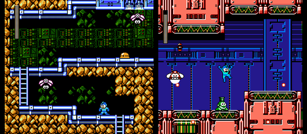
OK: I'm trying to make enemies in Witcheye flash red. When you hit enemies in video games, they're supposed to flash red, by god! This trope dates back to the days of indexed palettes, like those on the NES or SNES. Remember how I said that NES sprites were drawn with four-color palettes? So if you wanted to make the sprite flash red, you didn't have to change the sprite; you could just change that object's palette to red for a frame, and then change it back. ​
Picture
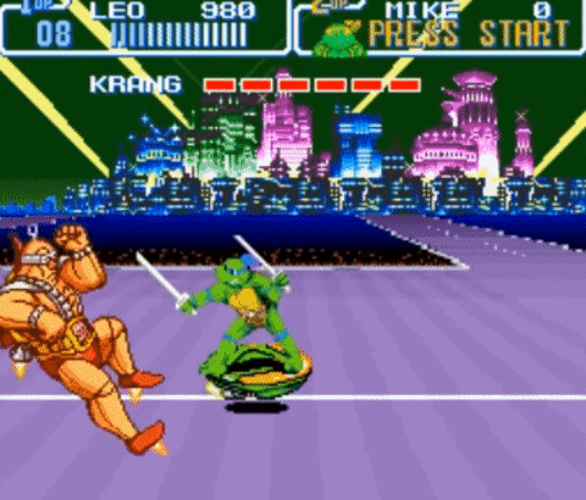
A SNES example, but the principle's the same
But today, it's not as simple. Sprites don't have indexed palettes--they just have the colors they have.

Unity, the engine I'm using to build this game, provides a color-tinting control you can use on your graphics. For the past two years of development, that's what I've been using for hit-flashes. The code is something like this:

    if (rend.color == Color.red) {
        rend.color = Color.yellow;
    } else {
        rend.color = Color.red;
    }

Every frame, this changes the tint of the enemy's sprite ("rend" for "sprite renderer") from yellow to red or back. Should do the trick, right?
Picture
"I don't know, Pete, but I'm adorably eager to find out!"
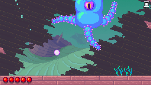
Here's the problem: the color tint doesn't always look so great. That's because it's multiplicative. Every color in the drawing of this big manticore is stored as 4 values:

r: a value of 0 to 1 indicating how red it is
g: a value of 0 to 1 indicating how green it is
b: a value of 0 to 1 indicating how blue it is
a: a value of 0 to 1 indicating how solid it is--so, 0 is completely transparent

You can make any color out of the combination of red, green, and blue.

When I tint the sprite red, each pixel of it has each of its foundational values multiplied with the foundational value of the red tint.

Let's say I'm tinting a white pixel:

WHITE PIXEL
r = 1
g = 1
b = 1
a = 1

multiplied by

RED TINT
r = 1
g = 0
b = 0
a = 1

so, we end up with the

RESULT
r = 1
g = 0
b = 0
a = 1

...which is pretty much what we want. The white pixel turns red.

Here's where we run into trouble, though. What happens if the pixel (like most of this manticore) is green?

GREEN PIXEL
r = 0
g = 1
b = 0
a = 1

multiplied by

RED TINT

r = 1
g = 0
b = 0
a = 1

gets us

RESULT

r = 0
g = 0
b = 0
a = 1
​

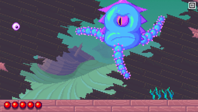
Well, it's not red. Actually, it's black. So when we flash between yellow and red tints, we're actually flashing between a kind of yellowish green and a mostly black.
Picture
Not what we're going for...
Picture
Here is is just in red so you can see it better--way too dark!
What we need is not to tint the sprite, but to actively recolor it. To do that, we have to dig into Unity's default sprite shader.

Remember how I said I was using these undesirable tints for two years? That's how little I wanted to mess with the shader.

Nevertheless, I decided I had to bear down and do it, and after a day or so of staring at mystery code, I figured it out.
​

So here's what you see if you open up Unity's default sprite shader:
Picture
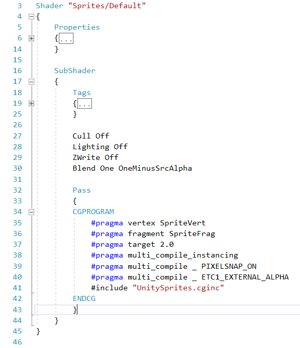
If you've done any coding before, you might notice there's nothing here that looks like it's drawing a pixel anywhere. (I condensed the properties and tags sections, because they're not going to help us at the moment.) It's impossible to modify this, because there's not really anything here.

The trick is, the "#pragma" directive basically just means "Take a chunk of code from somewhere else--a simple one that we're going to use in a bunch of different shaders--and just run with that." So the actual wheel-to-road contact isn't going on here. Specifically, "#pragma fragment SpriteFrag" is calling in a generic function called "SpriteFrag" that's stored somewhere else. If we want to modify anything, we have to modify that.

Poking around a bit, it turns out this code is in a file called UnitySprites.cginc. Here it is:
Picture
Now that looks more like it. We can actually take this code and put it back into Sprites-Default.shader, replacing the #pragma directive, and get the exact same results. (By the way, if you're going to poke around with the shader, I'd suggest copying the file and changing the name--use Sprites-DefaultModified or something like that.)

So this code is relatively approachable, right? The meat of it is really simple:

1. It pulls the color from the sprite coordinates it's looking at (SampleSpriteTexture).
2. It multiplies by the tint color (* IN.color).
3. It multiplies the three "chroma" channels (red, green, blue) by the alpha (transparency) channel, so that transparent pixels (ones where a is 0) come out as properly transparent.

We want our sprite to flash red, even if it's blue; we want the brightness of each pixel of the red version to be determined by the brightness of each pixel of the untinted version. So a bright blue pixel should come out as bright red, right? How are we going to do that?

Well, first we need to figure out the brightness of each pixel. Essentially, what would the sprite look like in grayscale--rendered just from black to white? We can do that by averaging the r, g, and b values, then reassigning each of them to be the average. Here's code that does that:
Picture
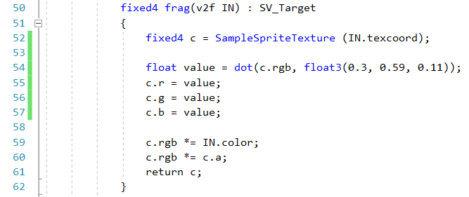
The line that might confuse you here is

    float value = dot (c.rgb, float3(0.3, 0.59, 0.11));

Why are we multiplying r, g, and b by different amounts? The answer is that the human eye is most sensitive to green, so we give it more weight in our brightness calculation. You could write this line to weigh everything equally--0.33, 0.33, 0.33--but it might come out looking a little flat.

So what we should get here is a grayscale version of the sprite. And indeed:
Picture
Now all that remains is to go back to our regular C# code and use the same tint function (which appears here in the shader as "c.rgb *= IN.color;") to tint the sprite red and yellow on alternate frames, right? ​
Picture
Hmm... actually, that doesn't look so great, does it? Everything looks kind of blah--kind of like it didn't quite make it back out of grayscale.

Can we come up with something more vivid? What if we take the brightness value, and use it to pick a color on a gradient from, say, black to red to yellow? That way when our recolor is applied, the highlights of the sprite still look bright and punchy; the overall effect is more incandescent.
Picture
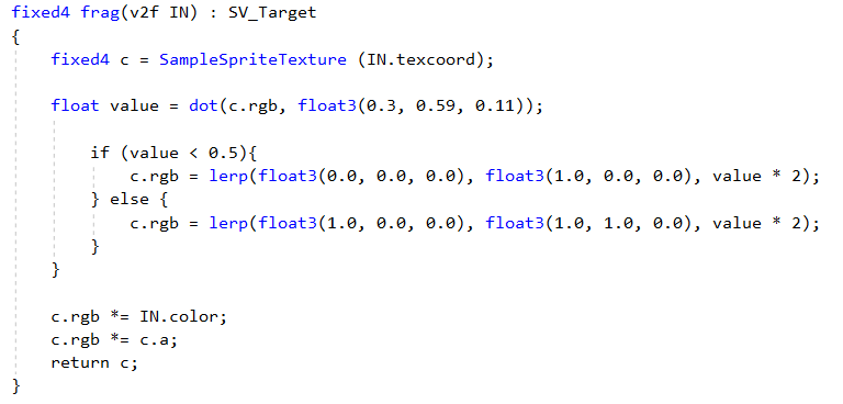
This code says, OK: if the brightness is less than half (value < 0.5), multiply it by two so that we get a range from 0 to 1, then use that number to pick a color between black and red. ("Lerp" means "linear interpretation"--the third value of the function is a number between 0 and 1 that indicates where the result should land between the first two values.) If the brightness is more than half (value > 0.5), subtract 0.5 and then multiply by two so that we get a range from 0 to 1 again, then use THAT number to pick a color between red and yellow. (You get yellow from maxing out your red and green channels--1.0, 1.0, 0.0 is yellow. Doesn't make much sense with paint, but that's how light works.)

Still with me? Here's how that looks:
Picture
Hey, not bad!

Now, the problem is, we can't turn this effect off, or modify the values--it's pretty much hard-coded into the shader. What we need to do is pass the shader some values saying when we want to recolor the sprite, and with what hues.

To do that, we reopen the properties block at the top of the file and add three new external properties: RecolorColorBlack, RecolorColorGray, and RecolorColorWhite. Those represent the three points on our value scale.
Picture
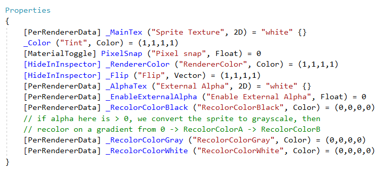
The only lines I added here were the last three [PerRendererData] lines (I mean, and the comments)
We use the alpha channel of RecolorColorBlack to determine whether we're going to recolor the sprite at all--if it's set to 0, we never even do the math here. If it's greater than that, we blend the recolored output with the base color for a subtler effect. That's what the line "c.rgb = lerp(c.rgb, gradientColor.rgb, _RecolorColorBlack.a);" does. If RecolorColorBlack.a is set to a full value of 1, we're fully recoloring; if it's set to 0.5, we're halfway between.

(Now, probably the more professional thing to do would be to pass this shader a separate value indicating how much of the recolored version to use in the final output... but at this point I feel like we're in deep enough!)

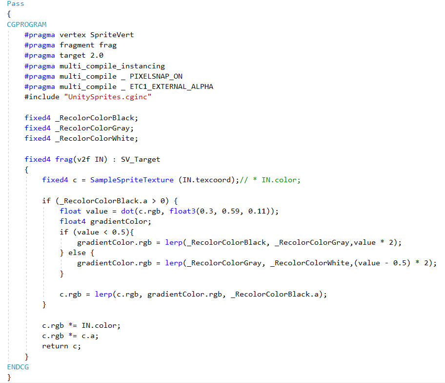
So here's the meat of the final shader:
Picture
Now, a final challenge: how do we access these properties within our regular old Unity code? It's not so bad. Here's the C# code to do that:
Picture
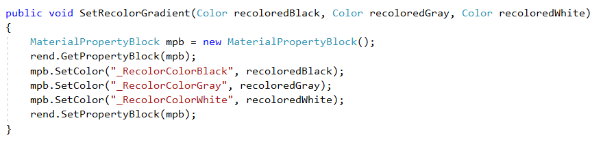
"rend" here is, once again, our SpriteRenderer.
With this function set up, we can change our enemy code to make sprites flash between their normal look and a black-red-yellow gradient:
Picture
Or between a black-red-yellow gradient and a black-blue-cyan gradient:
Picture
Cool but a little garish...
Or between a black-red-yellow gradient and an inverted yellow-red-black gradient:
Picture
Also pretty garish!
Or between a black-red-yellow gradient and a purple-pink-white gradient:
Picture
Makes me think of a mid-'90s Capcom arcade fighter, which is a definite plus, but looks more like it's charging up for an attack than like it's getting hit...
​Or, as I eventually did, between a black-red-yellow gradient and a black-red-yellow gradient blended halfway with the underlying color of the sprite itself, for a relatively subtle hit-flash effect.
Picture
Here I would conclude with some deep thoughts about the power of shaders, the long journey of computer graphics history, etc, but, well, we've all been through a lot. I had fun finally learning at least a little about the wide world of shaders, and I hope this has been at least a little interesting/helpful. Thanks for reading!
1 Comment

Making a Recoloring Shader in Unity, Part 1: Computer Graphics Then and Now

2/28/2018

0 Comments

 
Picture
I'm trying to make enemies in Witcheye flash red when they get hit, and it's a lot harder than you'd think. But to explain why, we're going to have to take a bit of a detour, into the fascinating history of computer graphics.

[cue Moog-heavy theme song]

Long, long ago, when I was a wee lad programming little games on my parents' IBM PCjr, computer graphics were a pretty simple business. Your screen ran at a resolution of probably 320x200, meaning that 60 times a second, the computer would draw 64000 pixels... which sounds like a lot, but is pretty small potatoes compared to today's computers, with resolutions of 2500x1400 or higher.

Because they were "only" handling 64000 pixels per frame, computers would handle all their graphics on the CPU. In other words, the same chip that was handling all the rest of the program information would handle all of the graphics, too. And it was nice: you had very direct control of any graphics you were creating. If you wanted to draw a red pixel in the middle of the screen, you'd say:

    Draw (160, 100, 4);
(or something like that... it's been a while!)

...and you'd get a red pixel (color 4 in the PCjr's 16-color palette) at coordinates 160, 100. Like I said: nice.

It was also not so nice, in that even pushing graphics at very low resolutions by today's standards, it was slowwwwwww. CPUs weren't really made for graphics per se. They could do the math just fine, but you could do a lot better if you had a specialized chip to handle the visuals while the CPU took care of everything else.

This is what console video game systems had. The MOS 6502 CPU in the Nintendo Entertainment System wasn't as powerful as the Intel 8088 CPU in the PCjr, but the NES could play games that were vastly more graphically intensive than the PCjr, with multiple animated sprites and scrolling backgrounds. That's because the NES had a dedicated graphics chip called the PPU--picture processing unit. The NES CPU can concentrate on handling the game logic, while the PPU does all the drawing.

This is a big reason that "console games" and "PC games" were separate things for a long time--the hardware dictated a different style of play. (One platform that straddled the lines was the Amiga, which, unusually for a computer, had a dedicated graphics chip, and as a result had a lot of flashy, graphically intensive games more like what you'd see on consoles.) Nowadays, though--and really since the late '90s--the distinction has been blurred, because PCs now have dedicated graphics chips of their own: GPUs. (You can probably guess the acronym there.) As a result, a high-powered PC can push as many polygons as your PS4, and games now routinely get released across platforms in almost identical versions.

With increased specialization, though, come some limitations. Graphics on the good ol' NES work in very specific ways. Backgrounds are constructed out of 8x8 tiles with four colors each. Foreground objects are drawn with four color sprites. The color palettes and other variables have certain rigid controls. You really can't just draw a pixel on the screen the way you could on the PCjr.

Likewise, your control of graphics on a modern computer is less direct than on an old 1980s clunker. That's because GPUs are so different from CPUs on the most basic structural level.

A CPU is a generalist; it's made to do just about anything. A GPU, on the other hand, is made to draw graphics--to calculate the shapes of polygons and to blast pixels onto the screen as quickly as possible. While a CPU can be put to the world's most complicated tasks, it can basically only do one thing at a time. (Well, nowadays CPUs can do a few things at a time, but never mind.) A GPU is designed to handle hundreds of thousands of pixels many times per second. It can do a lot of things at once, but they're relatively simple things.

The distinction here is kind of like the difference between one adult and 5000 kindergartners. The adult can file a tax return, but it will take him a lot longer to paint a fence. But getting kindergartners to do something requires pretty specific instructions. Likewise, GPU programs--called "shaders"--are very different from regular programs, and are often talked about with a certain degree of fear. ("Black magic," etc.)

This brings us back to where we started: I'm trying to make enemies in Witcheye flash red. I'll be back next week with an explanation of how I did it.

​
0 Comments

Pixel art for engineers: 7 tips for better programmer art

8/22/2017

2 Comments

 
Picture
I used to give guitar lessons, and there was an interesting difference between teaching kids and teaching adults. As you'd expect, adults generally had more natural coordination than kids, but unlike kids, they weren't used to being bad at things, so when they picked up a guitar for the first time and couldn't play it, they assumed the problem was permanent. I got a lot of definitive statements: "I'm bad at guitar." (Kids, by contrast, are learning all the time, kind of expect to start out incompetent, and just keep plugging along.)

The only thing I could say in those situations was "I can't promise that you'll be a virtuoso guitarist, but I can definitely promise you this: IF YOU PRACTICE, YOU WILL GET BETTER."

I have to keep reminding myself of my own advice every time I sit down to work on pixel art for Witcheye. A cursory glance at Twitter confirms that I am still not the world's greatest pixel artist--there's so much amazing work on my feed that I sometimes want to throw the laptop out the window--but I can at least say that I've gotten a lot better at it since I started this project.

I never even intended to be a pixel artist, actually. I just started on it because I needed art for this game. Luckily, I had the benefit of a ton of established knowledge on good technique. To the degree that any of this work looks presentable, it's due in no small part to great tips and tutorials from Helm, Derek Yu, Cyangmou, et al. If you're in the same boat as me, here are the tips that helped me the most. If you put your shaky confidence out of your mind and just try to adjust your work to these instructions, it'll probably improve--mine did. I still have a long way to go, but it's nice to see some distance traveled already.

1. Where's the light coming from?

Neophyte artists tend to have trouble with shading. When you're coloring in a line drawing, it's really tempting to put the dark color(s) near your outline, and the light color(s) in the middle of your object. Pixel artists call this "pillow shading" because it makes everything look like a puffy pillow. Luckily, better lighting isn't SO hard to do. (Obviously you could spend a lifetime learning about light, but it's easy to improve a lot right at the beginning.) Just think about where the light is coming from, and color the part of the object it'd fall on a bit lighter. Then color the part that would be in shadow a bit darker. If you're working in a style that includes outlines, you can even recolor the outline to be lighter near the light part--that tends to make it feel more three-dimensional. (A one-color outline can really flatten things out.)
Picture
I accidentally pillow-shaded this goofy little chevalier the first time around. The version on the right has more consistent lighting.
For game purposes, it may not be really possible to have all the lighting be totally consistent--sprites get flipped and rotated, etc. Derek Yu suggests placing your main light source above and slightly to one side of your objects. That's where most light comes from in the real world, after all, and light scattering is idiosyncratic enough in life that little inconsistencies between objects shouldn't be too glaring.

2. Keep it simple.
​

A lot of people say pixel art is about packing a lot of information into a tiny space. That's definitely true. But it doesn't mean you should fill your designs with a ton of fussy little details. I think it's better to have designs that read clearly, especially if you're going to try to animate them. If you draw a monster with 800 wriggling tentacles, you're going to be really stressed when you try to draw it again rotated 45 degrees to the left, and try to keep everything consistent.

For this game, I'm working in quite a low resolution--functionally, 256x144, smaller even than a NES screen. (I wanted it to look "pixel-y" even on a tiny phone screen.) Enemies are mostly 16x16, the size you see in Kirby's Adventure or the original Legend of Zelda. Complicated designs just don't work at that scale. Because of that, the character designs in those games have a simplicity that, as a nice bonus, is often quite lovely. I can't claim to be designing creatures as immortal as the noble Octorok, but it's a nice goal to shoot for.
Picture
Who needs arms? Not this guy!
3. Use fewer shades.

Unlike our 8- and 16-bit era forebears, we 21st-century indie developers have access to an unlimited panoply of colors. This is a hideous trap that should be avoided at all costs. Unless you REALLY know what you're doing, using a lot of colors is very likely to turn your work into a swampy mush. (It will also be much, much harder to animate--see above.) I ignored this advice at first--using a bunch of colors is so tempting, especially if you don't yet have the skill to make things read cleanly with fewer. I wish I hadn't. Now, for small to mid-sized creatures, I try to keep my colors to three shades per hue, with two extras between each used only for antialiasing. (More on antialiasing below.) So if I'm using red, I'll have dark red, medium red, and light red, and that's it. Think really carefully about whether you need more than that. (If you look at the #pixelart hashtag on Twitter, you'll see people much more talented than I am doing incredible things with incredibly few colors.)
​

(Here's an interesting aside: the irony is, in the 8- and 16-bit eras, they actually probably could've used more colors, because blurry old-school CRTs would smooth out the shading into nice soft gradients. It's only on sharp modern LCDs that that kind of color density starts to look like a cluttered, heavily-artifacted mess; pixel art orthodoxy has been forced to adapt.)
PictureThe old version of the gem (on the left) has twice as many colors, to no particularly good end.

4. Use fewer hues.
​

Again, a problem of abundance: there's nothing stopping you from giving a character green skin, purple eyes, a blue hat, one red shoe and one yellow one. And when you're trying to make each element read as separate in a tiny space, it can be tempting to do that. Every time I revisit my earlier art for this game, I've consolidated hues, and every time, the art feels more consistent, more clean, and more characterful. (Think about how you can see a streak of blue, red, and white and instantly identify Sonic the Hedgehog.)
Picture
Dude definitely doesn't need a green hat--notice how the bottom two rows hang together a lot better than the top one.
It's also great to have your color ramps overlap--that too will pull the piece towards greater cohesiveness. The middle row of Waddler sprites was probably fine, but in the second revision, the darkest color of blue on the body doubles as the darkest color on the shoes. The lighter parts of the shoes are shoe-colored--brown--but the dark gray-blue reads as a shadow, and makes the whole thing feel more of a piece.

5. Shift your hues.

I know I said if I was using red, I'd use dark red, medium red, and light red. That actually ends up looking kind of boring, so what I'd ACTUALLY do is use purplish red, red, and orangish red. Instead of just adjusting the brightness of a color, you can shift the darker tones towards "cooler" parts of the color wheel (generally, blue) and shift the lighter tones towards "warmer" parts (generally, yellow). You'll find the colors have a lot more punch and vitality. There's a great article about this at work in the beautiful pixel art game Frogatto here.
Picture
Stewart the Manticore, drafted with flat colors vs. polished with hue-shifting--see the way the green on the body goes towards yellow in the highlights and blue in the shadows.
6. Antialias sparingly.

Antialiasing is smoothing out a pixel-y edge between two colors by placing pixels of an intermediary color along the jaggier bits. When you first learn about it, it's easy to go overboard, and then you can lose details and (again) turn your work into a blurry mush. One rule I've found really helpful is to not add an antialiasing pixel unless the angle of the edge has changed. It's a little hard to describe, so here's an example.
Picture
This is a simplified bit of a cloud background I was working on. On the left, you can see where I overdid it on the antialiasing, unintentionally giving the edges an angular look. The antialiasing pixels should describe the curve of the edge.

7. Control saturation.

Or to put it more broadly, separate your layers. I think it's really important in game design to have the screen be instantly readable at a glance. Look at how clear these screens from Mega Man 4 and 5 make the distinction between foreground and background:
Picture
So crisp! So readable! So immaculately rendered!
Then look at the hash this Mega Man fangame makes of it:
Picture
Where the fuck am I
With the limited palette of the NES, Mega Man and other 8-bit games had to rely on color contrast to separate out foregrounds, backgrounds, and objects. That's certainly one way to do it. But if you have access to more colors, one nice approach is to control your saturation such that objects and (to a lesser extent) foreground topography are rich with color, while non-interactive backgrounds are desaturated (closer to gray, essentially). Here's an area where I think I did a decent job of that.
Picture
I hope some of this is helpful! (And again, it's really just consolidating a lot of great advice from pixel art forums and tutorials.) You may not be the one to make the next Owlboy or Iconoclasts--I know I won't--but you can certainly make your projects more eyecatching with a little practice. Thanks for reading!
2 Comments

Catching an escaping fish

8/2/2017

0 Comments

 
Picture
I just finished an amazing novel called The Bug, by Ellen Ullman, about a software bug that wreaks havoc at a tech startup in the mid-1980s. Among the many things Ullman captures beautifully about programming is the way an elusive bug makes you feel like you're going nuts. (The unlucky programmer assigned to fix it finds himself driven to madness by its seemingly demonic irrationality; the rest of the company nicknames it "The Jester." )

What's so disarming about a bug like that (besides the simple frustration of not being able to fix it) is that programming, in theory, is such a rationalist enterprise. It requires you to think in terms of concrete cause and effect, even as you build systems that are too complicated to really parse consistently on a rational level. Then, when it does something perceptibly "irrational," you feel as if the world has flipped upside down.

​Of course, barring the rare hardware failure, the fault is not in our computers but in ourselves, or in whoever else was working on the damn project--though since I'm flying solo on Witcheye, I can't even blame the schmuck in the next cubicle. Still, even as the only hand behind the wheel, as I tackle bugs in my game, I often feel some of the same enraged disbelief that Ethan Levin feels in The Bug. I'm well equipped to write about this right now because I recently came up against a real bastard.

Each level in Witcheye contains a blue gem; each gem is hidden in tricky ways. Some require you to pull off difficult feats of dexterity. Others are tucked away in unlikely corners of the map. Still others require you to think outside the box and interact in a way you normally wouldn't. As I've designed more levels for the game, I've had to come up with more clever ways to hide the things.
​
World 3 of Witcheye is an ocean; in one of its levels, you face a miniboss, a diving bird who swoops down through the water to try to catch you. (This was actually inspired by footage of the Pyrenean desman in David Attenborough's incredible documentary series Life on Earth.) There are lots of games where you fight angry fish--including this one, actually--but not as many where you get treated like a fish by the other locals, so that seemed like a fun surprise.

Picture
To set things up, I thought I'd build in another surprise: you enter a locked room where you've been conditioned to expect a fight with a few enemies, and you see a few of the aforementioned angry fish. "Simple," you think to yourself. (Poor sod that you are!) Then, of course, the look on their goofy little fish faces changes from menacing to spooked, and they hightail it out of the room as the bird splashes in from above. Cute little bit of business, right? And it also gave me a perfect way to hide a blue gem--attach it to one of the escaping fish, so that you have to catch him before he gets away. When I coded the scene and tested it on my computer, it worked perfectly. 

The first sign of a problem was that no one who tried it could find the gem. The levels are short, too, so there weren't that many places it could be. So at first, I smugly assumed that my testers just weren't thinking outside the box. (Prepare for dramatic irony, by the way.)  

But playing the game myself on my phone, I noticed something strange. I could still catch the fish, but barely. Even hustling directly from the door to the fish, it often escaped--and that was with someone who knew what to do at the controls. Someone who didn't would readily assume that the scene wasn't meant to be interactive, and that the fish were meant to escape every time.
Picture
GET BACK HERE
Had I changed the timing by accident? No--I headed back to my computer and caught the fish easily. Bad news, because bugs that turn up on the phone but not on the computer are the worst kind. Fixing a bug on the computer is relatively easy, since you can pause at any moment and get a very complete appraisal of the state of the game. On a phone, your tools are a lot more cumbersome--you have to run debugging tools on your computer while you play the game on the device, scanning through an overwhelming stream of data in search of whatever little thing has gone awry. Not only that, on the computer, you can change something, hit "play," and see your results almost immediately; on a phone or tablet, you have to wait for the entire thing to build, which can take a long time, then fuss with it some more and try again. Basically it's the difference between shooting a machine gun at a marked target under a spotlight, and shooting a slingshot at a bat in the dark and then wandering around trying to figure out if you hit it.

Anyway, I grudgingly made ready with the slingshot. The code for the fish itself was so straightforward (wait a second after the door locks, then head right at a steady speed) that I guessed the problem had to be with the water physics. Water slows you down; was it possible it was slowing you down more on the phone than on the computer? I put together a quick bit of test code that simply launched the eyeball forward at regular intervals and timed how long it took it to travel a certain distance, then ran the test on both the computer and the tablet. Sure enough, the computer version cleared the distance slightly faster.

My first instinct was that the problem had something to do with different frame rates on the phone. Frame rates are a real hobgoblin for game developers doing anything resembling physics. In the good old days of relatively simple processors, game developers could count on a device (like, say, a Nintendo Entertainment System) to behave the same way for every user, on every frame. That meant that timing could be consistent; if an enemy was coded to move one pixel every frame, you could be fairly sure that in one second of gameplay, it would end up 60 pixels away. And if it didn't, that would be because something else you were doing was slowing down the game.

On modern devices, nothing is quite as simple; there are a thousand reasons that your iPhone might take longer to render one frame than the next, and as a developer, you have very little control over them. So you have to accommodate that possibility all the time. This is pretty straightforward if things are moving at a steady pace (you just multiply the object's speed by the amount of time the frame took), but gets messy when you add in acceleration. At different frame rates, this can produce significantly different results; little differences compound themselves. With most of the game behaving the same on my test devices as on my computer, I'd pretty much ignored this fact and crossed my fingers, but here I was forced to sort it out. 

After digging through some of the calculus I vaguely remembered from high school, I figured out how to apply acceleration in a way that was, well, not quite frame-rate independent, but closer. My two tests were now producing close to the same results.

​Imagine my delight, then, when hours of this abstruse tinkering resulted in... the same problem. The fish was still damn near impossible to catch on the phone; the slight difference in physics hadn't been the issue at all. So what the hell was going on? 


What followed was a series of increasingly unlikely long shots, each as fruitless as the last, as I pulled out what little remains of the hair on my head and started in on my beard. As failed attempts piled up, I started to feel that I was losing my mind. Too many variables. And what do I know about how phones work anyway? What do I know about what the Unity engine is really doing behind the scenes? I was a tiny boatman on a raging sea, at the mercy of colossal forces far beyond my ability to comprehend. (This is the kind of cosmic-tragic mindset one gets into in these moments.) 
Picture
Indeed
Deliverance came, as it so often does, after hours of banging my head against the wall, by total random chance. Feeling burnt out, I was just idly playing through the water levels again on my phone, when I noticed something odd.

In Witcheye, you swipe to move and touch to stop. Underwater, a buoyancy force is always pushing you up towards the surface and water drag is always slowing down your horizontal motion. Therefore, touching to stop wouldn't work on its own; you'd stop, but then you'd start drifting upwards. So the game applies a check to see if you're touching the screen before it applies the two forces.

When I was testing the game on the computer, I'd click with the mouse to simulate a touch, then move it in the direction I wanted to move. As soon as that mouse movement crossed a short distance threshold, the eyeball would launch off, but buoyancy and drag wouldn't be applied until I released the mouse button. I never noticed, because I reflexively released the mouse button at the end of every swipe.

On the phone, I did the same thing, but I tended to lift my finger from the screen a little faster than I lifted the mouse button, as a natural part of the swiping motion. So drag started affecting the ball sooner, slowing down the rate at which it crossed the room. The two water forces needed to be applied as soon as the ball was launched, not waiting until touch was released.
Picture
My to-do list gets emotional
This was an error in my own thinking, obscured by the fact that I was playing in a slightly different way on the two different platforms. My failure to detect it came down to a classic case of programmer tunnel vision: when you expect a program to behave a certain way, you don't always notice what it's actually doing. Sure enough, I discovered, if I swiped and just never released my contact with the screen, the ball fired off untroubled by water drag entirely, as if the water weren't there at all. Catching the fish was, of course, made trivial.

Once I had that figured out, the problem was easy to solve; I fixed the water code to handle drag appropriately, then changed the timing so that the fish was catchable without the unintended benefit of the broken water physics.
Picture
Satisfaction at last
The feeling of aggravation at having spent a day fixing the results of my own shortsightedness was far outweighed by the ecstatic relief of solving the problem, and of the universe clicking back into logical functioning. I can't put it better than Ellen Ullman does in The Bug, so I'll leave the last word to her:
When I understood all this, I was elated, hysterical with happiness... Because the world suddenly felt right again--human, bounded, knowable. We did not live surrounded by demons. There were no taunting jesters, no vexing spirits. We lived in a world of our own making, which we could tinker with and control... The world of stories rejoined the world of machine-states. We were in tune: human and tool back on the same side. I was a thinking animal at the peak of my powers, I thought. By God, I wanted to pound my chest and bellow.
Picture
Still haven't figured out this one
0 Comments

Boss design: The making of Cycloptopus

7/19/2017

0 Comments

 
Designing bosses (and all challenges, really) for this game is tricky, because the character's abilities aren't bounded the way most platform heroes' are. A lot of standard platformer tropes don't really work. Because Mabel can fly, I can't put her in danger of falling off the screen; I can't put a boss's vulnerable spot high up in the air; I can't assume that the player will stay within a certain distance from the floor.
 
As I mentioned last time, I also wanted to avoid filling the screen with projectiles; that would make a boss harder, for sure, but it wasn't the feel I was going for in this game. My reference point here was Super Mario Bros. 3, not Ikaruga; I wanted enemies large and small to feel engaging and challenging, but always clear, simple, and readable too. 
Picture
An old-school segmented snake boss from the frustrating but memorable Fantasy Zone II
My initial idea for the boss of World 3, the ocean world, was a classic multisegmented serpent type boss, of the kind seen in countless 8- and 16-bit games; given Witcheye's focus on precise attacks on moving targets, it seemed appropriate and challenging. Ultimately, though, it felt a little too rote (again, see "countless 8- and 16-bit games"), so I decided to save it for a later miniboss, with some little twists, and do something more interesting for World 3.
 
It occurred to me that an octopus with rotating tentacles could work--a test of how well you could control the character in World 3's water physics, creating a constant threat in a simple, instantly understandable way. Here was my first prototype:
Picture
Cycloptopus here recoils when you hit him, and the tentacles rotate faster with each hit until he dies.
 
So, not the prettiest thing, but call it a proof of concept. When I finally had it all rigged up, it was actually pretty fun, but it felt a little primitive, both visually and gameplay-wise. Visually, it's a weird angle to be looking at an octopus, and the concept of moving around the thing a full 360 degrees required that it stay at that weird angle. Gameplay-wise, the rigid sprite-based tentacles felt stiff to engage with, and the fight felt unstructured--just doing the same thing over and over. A song with no chorus, if you will. The distinction between hittable spots and damaging spots also felt fussy and unclear; sometimes it seemed like you were OK, but the space between tentacles at the base was really small, and that made it frustrating.
 
All that aside, the idea worked well enough that I decided to go with it. The first thing I had to fix was the look. I drafted up a less awkwardly posed body for the boss, and decided to replace the rigid single-sprite tentacles with multisegmented ones (again, a nod to the multisegmented 8- and 16-bit style of yore). I was pretty amazed when my tentacle code worked on the first try.
 
This was already feeling better, but the problem with a cramped target area remained. I decided three tentacles would be better than four--enough to get the point across, so the poor guy wouldn't look totally disarmed, but leaving enough space to hit his fleshy underside.
Picture
Speaking of fleshy underside, once I saw my new creature in motion, I realized that, obviously, when he was presented at this angle, the simplest thing would be to hit him from the top or the sides, avoiding the tentacle area altogether. That clearly would defeat the entire purpose of the tentacles, so something needed to be done. I added spikes around the top and sides of the head to ward the player off. This had the added benefit of making him look cooler and more regal, like some kind of samurai squid. 
Picture
On to the question of repetitiveness. What was the right way to vary the tempo of the fight? Was it enough to just have the tentacles speed up as you hit him? No--it felt like there needed to be more of a sense that you were proceeding through phases. Now, an aside here: I don't really like long boss fights. I don't like bosses with endless phases; I don't like bosses that soak up a ton of hits. The bosses in the Metroid Prime games make me want to stop playing. (My fire-button finger is aching at the memory.) When a boss takes ten minutes to fight, the designer also can't make it very difficult, because it would be too annoying to retry. The ideal to me is a Mega Man boss--fast, tough, quick to restart, doable in seconds once you know how.
Picture
A classic.
So I didn't want to slow things down too much. I just wanted to give the fight some structure and make you feel like you were making progress. For the same reason, I also don't like bosses that have long periods of invulnerability (who plays games for the thrill of waiting for a glowing orb to open up?), so I had to be careful about how I did it. 
 
I decided to divide the Cycloptopus fight into three phases; each time you score three hits on him, he'll freak out and thrash around the room in a circle, waving his tentacles, then return to his normal pattern, but moving faster. You can't hit him while he's circling, so I'm breaking my own rule here (OK, it's more of a guideline), but the move is dangerous and fast; it's not like you're just sitting there waiting for him to finish. Here's how it broke down:
 
HOVERING - SPEED 1 
score 3 hits
THRASHY CIRCLING
HOVERING - SPEED 2
score 3 hits
THRASHY CIRCLING
HOVERING - SPEED 3
score 3 hits -> victory
Picture
This felt pretty good--there was variety, increasing difficulty, concrete evidence that you were making progress, rising tension when you saw how fast he was moving after the thrashy part. One quick tweak I made after a few runs on this version was that it didn't feel climactic enough to beat him. The last hit you had to score, he was moving at the same speed as the previous two hits. So I added a final phase:
 
HOVERING - SPEED 1 
score 3 hits
THRASHY CIRCLING
HOVERING - SPEED 2
score 3 hits
THRASHY CIRCLING
HOVERING - SPEED 3
score 3 hits
THRASHY CIRCLING
HOVERING - SPEED 4
score 1 hit -> victory
 
This gave you one last scare when he was moving super fast at the end--hard, but you only have to hit him once. I thought that would give the player the feel of a nail-biter ending, while being not TOO likely to kill them frustratingly right at the finish line.
 
The pacing felt great now, but something was bothering me; it was possible to just hang out at the bottom of the screen invulnerably and wait. Doing that didn't accomplish anything, but it didn't feel active and engaging, either. Plus, I had character to think about. I didn't want it to feel like you, the player, were just going into this creature's domain and beating him up when he essentially had no beef with you. His aggression needed to match yours.
 
I decided to give him a projectile--but only one, and a simple one. Periodically, he'll fire a wide crescent-shaped beam straight down from his eyeball. That meant that you couldn't just hang out underneath him forever. Suddenly the bottom half of the screen felt like an active space.
 
Having him fire without warning felt a little unfair, so I made his eyeball flash for a few frames before he fires. He also slows down a little in his endless circling. Both of those effects give you a warning even if you aren't looking directly at him. 
Picture
Now things were really cooking. It's amazing to feel a gameplay element becoming more fun as you tweak it; it's hard to believe that you can do it sometimes, but if you're tenacious, all the little changes really do start to add up to an intangible "rightness."
 
A few more little changes were in order. Because the water physics of this game push you upwards on every frame, you'd sometimes get hit by a tentacle immediately after successfully hitting the boss's underside; the upward push kept you from bouncing safely away. That didn't seem fair or fun, so I did two things: I added a "hard rebound" flag to Cycloptopus's attributes, so that the player's rebounding speed upon hitting him is doubled. That pushes you more quickly out of the way. I also made the collision boxes on the tentacles quietly disable during the boss's invincibility frames, so that if you happen to catch the edge of a tentacle while rebounding, you'll pass safely through. This had the potential to make the tentacle collision feel janky or broken, but because you were getting slapped back downward quickly, the disabled tentacles ended up being mostly invisible to the player--just a little margin of grace to make the experience less frustrating.
 
Speaking of which, the boss was HARD. I could beat it, but by this point I had played it possibly more than anyone else in the world ever would, so I wasn't a good barometer. (And even then, I still got hit every time.) So the last round of tweaks was simple: I slowed down the boss's tentacles, slowed down his speed while hovering, slowed down the speed of his projectiles, slowed down his thrashy freakouts, and shrank the hitboxes a little on both the projectiles and the tentacles. (As I wrote about here, this last one is a good trick to keep in mind. You don't want to do it so much that the game feels broken, but if you can give the player an occasional feeling of "YIKES I just BARELY missed that"--because the graphic of the damaging object is slightly larger than its effective boundaries--you can make the fight more exciting and less frustrating at once.)
 
Voila! A boss that's distinct from the other enemies, intimidating, challenging, easily "readable," not a hit-sponge, not a producer of bullet hells, difficult but beatable within 30 seconds with a little practice. It was truly gratifying to start from a simple idea (and a janky test version) and work up to an engaging fleshed-out encounter. (And, PS, I did eventually get my segmented serpent.) Thanks for reading!
Picture
0 Comments

Designing an Uncluttered Game

7/5/2017

0 Comments

 
One tricky part of designing Witcheye was that the player is overpowered. Since you can fly anywhere you want, what's to stop you from just flying over all the enemies? The obvious way to address this was to give enemies a ton of dangerous projectiles. After all, that's what shoot 'em ups do, sometimes to hilarious/ecstatic extremes. 
Picture
AHHHHHHHHHHHHHHHHHHHHHHHHHHHHHHHHHH
​But I didn't want to make a shmup; I wanted to make something that felt like a platformer. Having a ton of projectiles flying around felt like a cheat, and like it would clutter up the simple, clean feel I was going for. There's definitely an appeal to the sensory-overload approach, but it wasn't what felt right here. Basically, I wanted about the same projectile density as Super Mario Bros. 3. 
Picture
OK, that's more like it
Working within that restraint forced me to be more creative about how enemies would threaten you. Many of them DO have projectiles, but they're generally quite simple ones that function almost more as melee attacks. At least until later in the game, there are few challenges with really complex "bullet hell" type patterns. 
Picture
Buddy, I know you're really trying, but...
That also meant carefully designing level layouts to give enemies the advantage, funneling the player through tight areas where enemies without big fusillades of projectiles could still pose a threat. This is part of why the game is contained to horizontally scrolling levels: it's a way to keep the action tight and focused, with lots of forward momentum, and no incentive to just drift off in another direction.
Picture
These jellyfish can be hit from above but not from below; the contours of the level introduce them in a way that gives you the advantage, but then turns the tables once you've had a chance to see how they work.
But even with those design principles in place, you'd still have the temptation to just fly over a lot of the game without really interacting with the enemies, and that wouldn't be much fun. 

Witcheye tries to address that in two ways. One, most levels contain locked rooms that require you to engage a set of enemies in order to win a key and a way out. 
Picture
Not a prisoner, I'm a free man...
Two, there are four collectible gems in each level, usually held by enemies (or as rewards for exploration). These are totally optional, though they're required to get the best ending, and if you miss one in a level, you'll get an empty slot and a dinky cowbell sound on the end-of-level wrap-up screen, instead of a satisfying slot-machine-y clatter. 

Watching people play, I've found that almost everyone instinctively goes for the gems--or just for the simple fun of fighting the enemies, which makes its own satisfying set of sparks and sounds. If you don't, that's fine too! I'll always try to design in a way that allows a range of approaches. As always, the goal is to nudge the player gently in a general direction... without making them feel like they're being nudged. 

​Thanks for reading!
Picture
0 Comments

High Challenge, (Relatively) Low Frustration

6/28/2017

1 Comment

 
Last week, I wrote about challenge in games, how games that are too easy feel awfully flavorless, and how hard it is to get it right for a range of players with a range of skill levels. Actually, it's beyond hard--it's impossible. Some people will always find your game too easy, and some will find it too hard. 

Having accepted that, the best we can do is to try to mitigate the frustration felt by players who don't start out with amazing skills. Challenge is one thing, but frustration, while it might be inevitable and not even totally undesirable at times... well, a little goes a long way. So here are a few thoughts about keeping the challenge satisfying while also keeping players from throwing their phone/laptop/controller out the window.
Picture
FML
1. Lower the stakes.

One thing that annoyed me as a self-identified hard-ass old-school gamer in the '90s was that people (the damn kids, mostly) would complain about dying in games. Having beefed it probably thousands of times in the course of beating Super Ghouls 'N Ghosts, I found that a tough position to sympathize with. I mean, one of the central principles of a video game is that you're stepping into a virtual space--where better to take risks you wouldn't take in real life? Unlike in your day-to-day existence, experimentation is almost completely untrammeled by consequence--what a gift! It's not like when you die in Super Ghouls 'N Ghosts, Tokuro Fujiwara appears in your living room and pees on the floor. (Though after a while, you may feel that he has.) What does dying in a game really cost you?

But to be fair to the soft-bellied youth of the '90s, by the period that they were starting to complain about it, dying in games really did cost you something: time. Did it ever. Whereas taking an eagle to the face in Ninja Gaiden usually meant a matter of seconds--minutes at most--to get back to where you were, dying in The Legend of Zelda: Ocarina of Time could mean an hour of listening to a filibustering owl, lectures from a fairy, and grand, game-interrupting announcements that you'd managed to secure another key. Perhaps because it's so annoying to die in OoT, the game is also too easy; the designers had to cap the challenge because failure was so frustrating. 
Picture
The feeling is far from mutual, pal.
​To me, there's a clear solution: lower the stakes. Failure is a crucial part of success; without it, success is unearned and unsatisfying. So don't make like Ocarina and make failure itself almost impossible. Make failure low-cost. Restarting should be fast, and levels should be short. When you die, it should take you milliseconds to get back into the action; otherwise, you're taken out of the flow every time, and that really does cost you. Luckily, modern indie games like Spelunky and Super Meat Boy have this thoroughly figured out; they're hard as hell, but dying just makes you want to try again. (During development, Satellina had six levels per "suite"; your goal was to clear them in less than three minutes. That was fine, but when I cut it down to five levels in 2:30, it instantly felt better.)
Picture
It couldn't be helped
​In Witcheye, I'm not shooting for Spelunky-level difficulty. A few savants aside, most people found Satellina pretty hard, so for a follow-up, I wanted to make something breezy and fun; still hard enough to be satisfying, but generally more of a romp than a gauntlet. (Beating the game on normal difficulty will unlock a harder mode where I'll really break out the hammer and tongs, if that's your thing.) 

The reference point I'm looking towards on this score and many others is Super Mario Bros. 3. That stone classic is actually pretty tough, but people don't seem to remember it that way; when gamers are talking over the "Nintendo-hard" games of yesteryear, it rarely comes up. Part of that is that the difficulty of SMB3 is so exquisitely tuned, but I think another big part of it has to do with tempo: SMB3's levels are generally very short, and 1UPs are abundant, so you rarely get sent back to the beginning of the world to redo parts you've already mastered. Pacing-wise, it's not so far off from Super Meat Boy. It feels very more-ish. 
Picture
​(Of course, SMB3 also just feels right in about a hundred other ways. One that I've also had in mind while designing Witcheye is just how much stuff it throws at you--so many memorable little touches in that game. More on that later.)

I'm keeping levels quite short in Witcheye, and restarting is instant; there are no lives, so you don't have to stress about your longevity. 

2) Work discreetly on the player's behalf.

I've already gone on for a bit as usual (now who's the filibustering owl?) so I'll keep the second point shorter: the player should always feel like failure was their own fault. Tie goes to the runner.

Now, this can be overdone: you don't want it to feel like the game's on autopilot (again, looking at you, '90s-'00s Zeldas); you don't want to separate them from the physical experience of being in the game. And you don't want them to feel condescended to, or you'll rob them of the satisfaction they're working sincerely to earn.

But when something's close, if you quietly break a tie on the player's behalf, they'll get the thrill of cheating death--what could be better? In Satellina, you're trying to avoid red particles and collect green particles. You'd never know this as a player, but the green particles have hitboxes that are slightly larger than the particle graphics themselves. The red ones? Slightly smaller. That means that maybe 5% of the time that you'd crash into a deadly red particle--or whiff on an attempt to collect a juicy green particle--I give you the benefit of the doubt. It's (hopefully) imperceptible, but it makes the game just a little bit kinder, without lowering the perceived challenge, since the two kinds of particles are still very much there, very much tangible, and very much something you need to stay spatially aware of. Witcheye gets up to some of the same tricks; I'll explore them in more detail in a later post about boss design. 

​Thanks for reading!
Picture
Ah, satisfaction
1 Comment

How Spicy Is It?: On Difficulty

6/21/2017

0 Comments

 
Picture
I've never worked in a restaurant, but I can guess a question that no waiter wants to hear: "How spicy is it?" Um... well... medium? Everyone's different. If you eat spicy food regularly, you develop more of a tolerance for it, and there are apparently genetic factors in play too. So neither the waiter nor the diner are in a good position to answer that question.

Likewise, try asking a game developer, "Is it hard?" The problem is that I don't know how much time you've spent with games, how coordinated you were to begin with, or how much of a tolerance you have for frustration. For some people, a super-punishing game is like the endorphin rush of chomping down on a habanero. For others, it's more like the screaming pain of, uh, chomping down on a habanero. 
Picture
OH GOD THE BIRDS
I grew up in an era where the content of games itself was often more challenge than anything else. Coming out of a competitive arcade culture, players in the '80s were used to games that pushed back. But moreover, developers with limited resources could deliver a more substantial experience by fighting your every move tooth and nail. Once you know how to do it, you can beat the original Ninja Gaiden and Castlevania in 20 minutes each, but getting to that point could take months or years. I will never forget the night in ninth grade that Mike Brownell and I committed to beating Ninja Gaiden, consumed a grocery bag full of Nescafe and Pop Tarts, and hurled ourselves at Level 6-2 until 4 AM, finally giving up almost in tears. (The internet was a little slip of a thing back then, so we didn't know that it was one of the most notorious levels in game history.) Since then, of course, the business of games has grown a lot, so you can pile a lot more non-challenge-based stuff into a game and not have the challenge need to carry so much weight.

There's all kinds of macho posturing now from old-school types about how games today are too easy... and I'm completely on board with it. No, I kid--I find "git gud" machismo as off-putting as all the other kinds. But I do feel that when a game doesn't have enough challenge, it kind of slips through your fingers. The lows may be higher (you don't get as frustrated), but the highs are lower (it's not very gratifying to win if you didn't have to do anything), and that's not very exciting. It kind of feels like chewing your bovine way through a wad of flavorless gruel. 

So I think games need a certain degree of resistance. At the same time, I've never had any interest in making games that are just punitive or sadistic--the point is still to have fun! It's just that different people have different ideas of fun, and that's tricky. 
Picture
Laugh it up, you dick!
​The best solution is, of course, to have people test it. And to extend the metaphor, there's a hand-pulled noodle restaurant here in New York that answers the "how spicy is it" question exactly that way: they've got a chart on the menu that tells you what percentage of people order which level of spiciness, so if you have a sense of where you are in the general population as far as spice tolerance, you can guess at what's right for you.

When you're developing a game, you'll play it to the point of mastery and then some, and you'll completely lose your reference point for what others will find difficult. Nothing is more illuminating than watching someone play your game for the first time. They will find amazing new kinds of incompetence that you never even thought were possible, and it will blow your mind; then you can adjust accordingly.
Picture
I can count the people who've fought this Witcheye boss on one hand, and I've already toned it down three times
​But while you can make those adjustments, a game will always be too hard for some and too easy for others. When I released Satellina, half of the players I heard from told me it was impossible, and the other half said they beat it in half an hour--and why was it so short?

​To me, the best you can do is keep the challenge high (and satisfying) while trying to mitigate the frustration. Aren't those two things inextricably coupled? Well, coupled, yes, but inextricably, no. Maybe the metaphor is, you can serve some goddamn spicy food, as long as you put a nice glass of coconut milk next to the plate. (OK, I'll stop.) I'll be back with a few thoughts on how to do that next week. Thanks for reading!
0 Comments

Designing enemies

6/14/2017

1 Comment

 
Picture
In a way, the idea of a bunch of cute little monsters is Witcheye's whole reason for being. I've had the above page from the Japanese Kid Icarus manual hanging in my apartment hallway for years, and I love it. Among the many things I loved about poring over game manuals back in the day was miniature menageries like this. There's something so appealing about these little collections — a big part of the attraction of later series like Pokemon, I think. (They also make me think of notebook pages from 18th-19th century biologists, always cool to look at.) Having made a game that was all celestial abstraction, I was excited to make one with more goofy personality.

The goal for this game was to come up with a bunch of enemies who had unique behaviors & vulnerabilities, each a kind of little puzzle as to how you deal with them. Yes, there are recurring enemy types — when you learn to handle one type, you may meet a trickier version of it a couple levels later. (In other words, this is a video game.) But I'm really trying to make each type distinct, so you always feel like you're seeing something new.
Picture
From a gameplay point of view, designing enemies for this game has been an interesting challenge. Since the eye itself is both player and weapon, I can't just have generic grunts who try to bump into you. That affected their visual designs too — I needed to clearly telegraph what was dangerous and what was vulnerable. Then of course I try to squeeze in some personality... not always easy to do all that in 16x16 pixels!

Picture
Something that always makes me laugh in The Great Gatsby for NES is the look on the waiters' faces when you clobber them (for no reason!) Maybe there's something wrong with me... but there's lots of that kind of slapstick with the monsters in Witcheye.
Picture
Personality is also an interesting question as part of a dialogue with gameplay. These little leaf guys (I call them Leaf Meelone, obviously) struck me as basically amiable little doofuses, who originally didn't really do much. They just shuffled around, very occasionally spitting a languid projectile in your general direction. The problem was, they weren't that exciting to fight, so I ended up raising their firing rate, making them more aggressive. But when I did it, part of me thought, "...but they wouldn't act like that!" 
Picture
Counting all the variations of each enemy, there are currently about 80 enemies and bosses designed for this game, with hopefully 100+ in the final version. As benchmarks, I used Super Mario Bros. 3, which has around 60, and Mega Man 2, which has around 35. But both those games have a range of other challenges (platforming, etc) that Witcheye doesn't, so I thought I'd aim high in this department. Please excuse the hubris! 
Picture
1 Comment

Welcome to Witcheye

6/7/2017

0 Comments

 
Picture
Picture
Hi! I'm midway through developing my third commercial game, Witcheye, and I'm going to share a few thoughts on it here.

This game was meant to be a kind of stopgap step forward between developing Satellina (my first game, explicitly conceived as the simplest concept I thought I could squeeze some real gameplay out of and actually finish and get released) and a more ambitious mobile-game concept I was chewing over.

Well, as you might've predicted, this stopgap project took on a life of its own, and has turned into a massive endeavor itself--so much so that I ended up inserting another stopgap game, Satellina Zero, within the development of my supposed stopgap game. (Satellina Zero I actually did manage to squeeze out in six months or so, so maybe I'm getting better at estimating these things.) (Probably not.)

At its core, Witcheye DID have a simple concept: basically, what if you were playing Breakout, but could control the ball directly? All you need to do is swipe in the direction you want to go! This appealed to me because you could only really do it on a touchscreen; I could make a big, colorful, old-school adventure without relying on the clunky virtual controls you see in a lot of mobile games. When I'm making a mobile game, I want to use the actual innate qualities of the device, instead of trying to cram a different control paradigm onto an object that isn't really built for it.

Once I had that in mind, I saw two directions I could take it. One was a kind of score-attack game, where you try to control your swipes and rebounds to clear the screen of bricks or something like them, with various complications and bonuses and risks. The other was, well, a big old-school adventure, with a bunch of colorful worlds to explore and enemies to fight. In other words, it basically came down to a split between focusing on mechanics, and focusing on content. 

Perhaps you will detect a certain wistfulness in my tone as I tell you that I decided to focus on content. Ultimately, what I love about games tends to be exploring a space, seeing neat stuff, overcoming tough challenges, so those are the things I chose to pursue. But the more mechanical approach intrigues me too--and might have been less work!--so if this one doesn't kill me, maybe that'll be the next one!

So, a cautionary tale: if you're a solo developer, trying to make a game where the appeal is that it's bursting with content is maybe not the best idea. But I can't exactly say I regret it. While I've got a long way to go here, it still brings me a lot of pleasure to make a new enemy or background or secret. I hope it'll be as fun for you to discover them as it was for me to come up with them. 

​Thanks for reading--more to come!


0 Comments

    Peter malamud smith

    Thoughts on developing Witcheye for iOS and Android

    Archives

    March 2018
    February 2018
    August 2017
    July 2017
    June 2017

    Categories

    All

    RSS Feed

Powered by Create your own unique website with customizable templates.